With my trusty selfie stick kit (don't laugh) I decided I would have my own little photo shoot because I loved my outfit that day.....and love taking pictures. My outfit was modern, yet still fun and hipster-ish. After editing some filters over it, the image reminded me of something I would see in a magazine. Thus, the idea of a Magazine Mock-Up Spread come to mind. I recorded a basic version of my process and the completed design down below:

Step 1: Prepare Photoshop File
Between InDesign and Photoshop, I decided to edit this on Photoshop since I knew this was mainly a concept and I was not going to actually need a final version. However, for the future I would edit the images separately in Photoshop, then once I have all my pieces, I would set up the layout in InDesign.I created a new document in Photoshop and set the dimensions for two 8 by 11 inch pages.
Step 2: Import Images for Editing
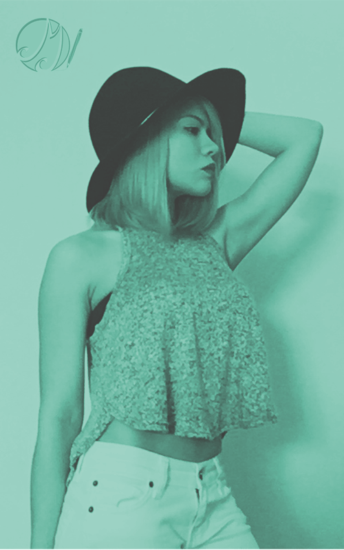
On the document I created layers (and folders for organization), then imported the images and placed them in their locations. For the image of the model I copied the picture so I would have two of the same image. On one of them I erased everything in the background except the shadow, and the second one I erased everything in the background including the shadow. By doing this, the layer with image that included the shadow was underneath the image without the shadow, and I could change the opacity of the one layer without affecting the other layer.Below is the original image:


Step 3: Text and Font
For this part, I created text layers for "Contemporary" and "Style" titles. Then I created the text layer of the main article. I typed the article on Microsoft Word so that I could use spell check and edit any grammar errors. Afterward, I copied and pasted the article on that text layer. Lastly, I edited the font and font size . . . however that could be a whole other blog since I realized I did a lot of explaining on just editing the image.
Step 4: Review
This is only a mock up because on the final version I would have the pages actually separated and possibly a white border framing the page to keep the edges clean. Also, I would have used InDesign for the laying out part. Not only do I have this main post about creating the piece, but I also wrote a short article about the actual outfit and the inspiration for it. So, that's like an extra piece of reading!Please let me know your feedback, and questions, or suggestions for a project! Thank you! Be creative!